Samsung knox

Redesigning the trial sign-up funnel

Samsung Knox.com is a B2B portal covering a complete suite of enterprise mobility software solutions.

I redesigned SamsungKnox.com's trial sign-up flow to cut friction between an interested visitor and a started trial. The result was a 5x increase in "Try for Free" click rate after the redesign shipped.

Redesigned Samsung Knox homepage
My contributionUX/UI design · UX research collaboration · Content strategy collaboration
CollaboratorsProject manager (Vancouver) · HQ marketing team (Korea) · QA team · UX researcher
ProductSamsungKnox.com, a B2B portal covering Samsung's enterprise mobility software suite
Timeline2018 – 2019

SamsungKnox.com served IT administrators comparison-shopping enterprise mobility software.

  • Users had no direct way to start a trial from the pages where they were actually evaluating a product. The IT Solutions pages had no trial CTA at all.
  • Google Analytics showed 50%+ of sessions were on mobile, but key page elements (including data tables) weren't mobile-optimized.
  • Getting in touch with sales required hunting for contact information; there was no direct path from a product page to a real conversation.
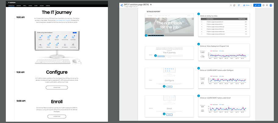
Samsung Knox IT Solutions page before the redesign
The IT Solutions page before redesign: no direct way to start a trial.

1. Emphasized the call-to-action buttons

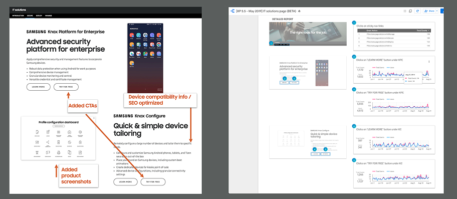
  • Added prominent "Try for Free" and "Apply for Free" buttons directly on the IT Solutions and Knox Configure pages.
  • CTAs placed where evaluators were already reading feature details — no detour to find sign-up.
  • Paired CTAs with supporting product screenshots and device compatibility information.
  • Gave admins the confidence to click without leaving the page to verify fit elsewhere.
Redesigned Samsung Knox pages with prominent trial call-to-action buttons
The redesign: new CTAs and product screenshots added to the IT Solutions and Knox Configure pages, tracked against a detailed analytics report.

2. Made the site mobile-friendly

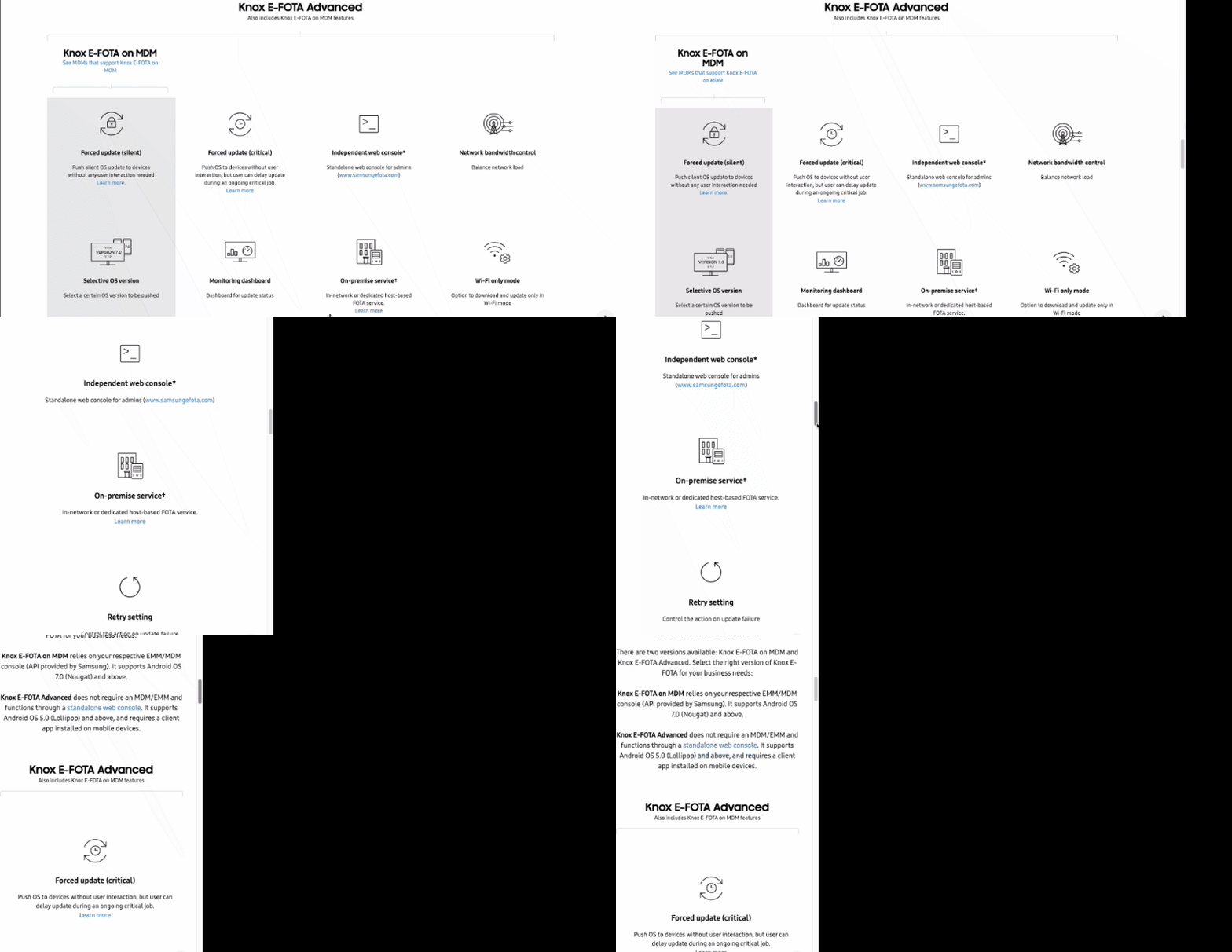
With Google Analytics showing 50% or more of all sessions on mobile, I made key layout elements responsive, including dense comparison tables. This let mobile visitors actually evaluate the product instead of fighting a desktop-only layout.

Responsive Samsung Knox feature comparison table on mobile
Making dense information like feature comparison tables responsive and accessible on mobile.

3. Put contact paths on every product page

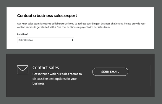
Added contact forms directly on product pages, which were integrated into Salesforce. This way sales follow-up could start promptly, instead of requiring an IT admin to find a separate "Contact Us" page.

Contact form embedded on a Samsung Knox product page
Contact forms added directly to product pages, integrated into the Salesforce CRM database.
5x
increase in "Try for Free" click rate after the redesign shipped
12,418
new sales leads(Jan - Sept 2019)

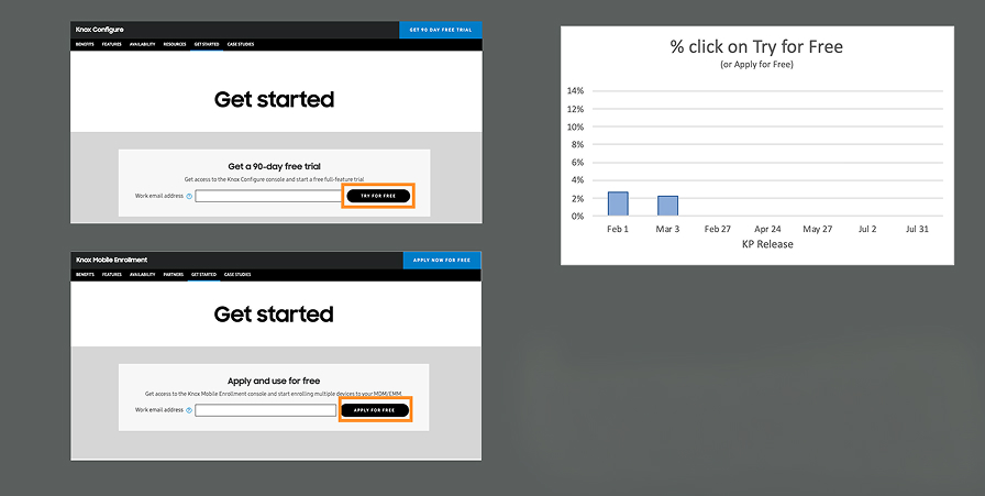
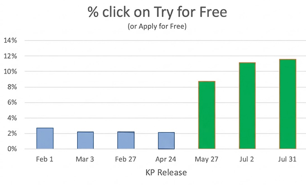
Analytics tracked the CTA click rate for several months before launch as a baseline. It held flat around 2% from February through April. After the redesign went live, the same metric climbed to roughly 9%, then 11%, then 11.5% over the following months.

BASELINE: "Try for Free" click rate held flat around 2% before the redesign.
Analytics chart showing a roughly 2 percent baseline click rate
AFTER LAUNCH: Trial interest improved 5x versus baseline. New call-to-action buttons on IT solutions page also helped to drive click-throughs to product pages, which led to overall improvements in trial interest.
Analytics chart showing increased trial interest after launch

The new Salesforce-integrated contact forms also began generating sales leads directly from product pages, shortening the path from "reading about a product" to "talking to sales."

Mobile optimization

Work often lost priority to other development work, so responsive improvements had to be continually re-advocated for rather than landing all at once.

Trial funnel bottlenecks

Click-through into the trial flow improved. However, once inside, users were still getting stuck in the enrollment step itself. The logical next project was optimizing enrollment, which had its own technical constraints.

Sales leads conversion

The new contact form successfully generated leads, but consistent sales follow-up on those leads was outside what the design change alone could fix.